Menlo College
Rebuilt a broken higher-ed site to drive enrollment and clarity
Integrity—digital agency
Overview
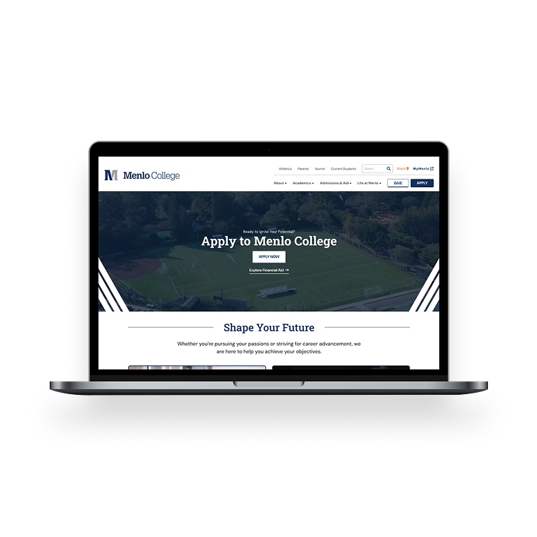
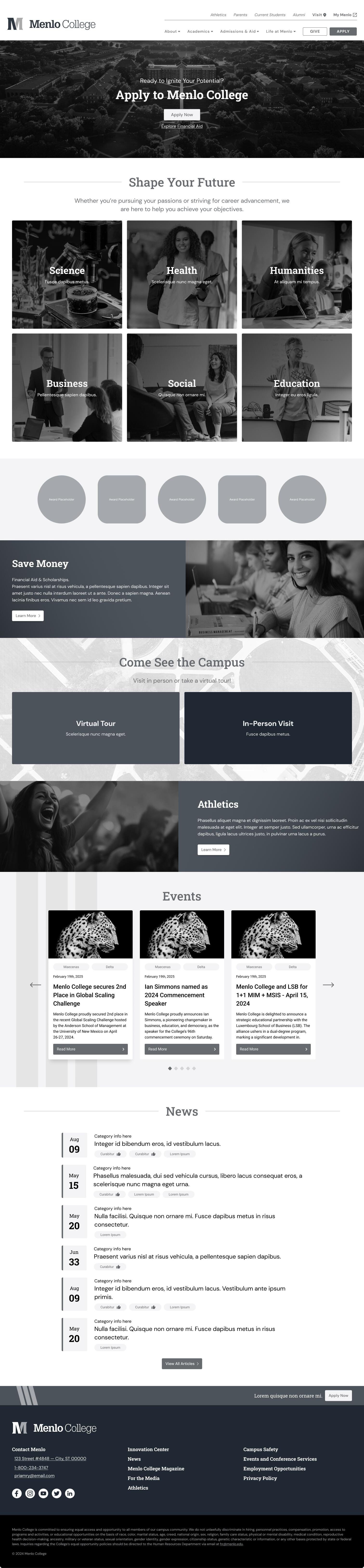
Menlo’s site was confusing, slow, and buried its most important actions. I led the redesign from IA to UI—improving navigation, performance, and mobile usability to support real enrollment lift.
What wasn’t working
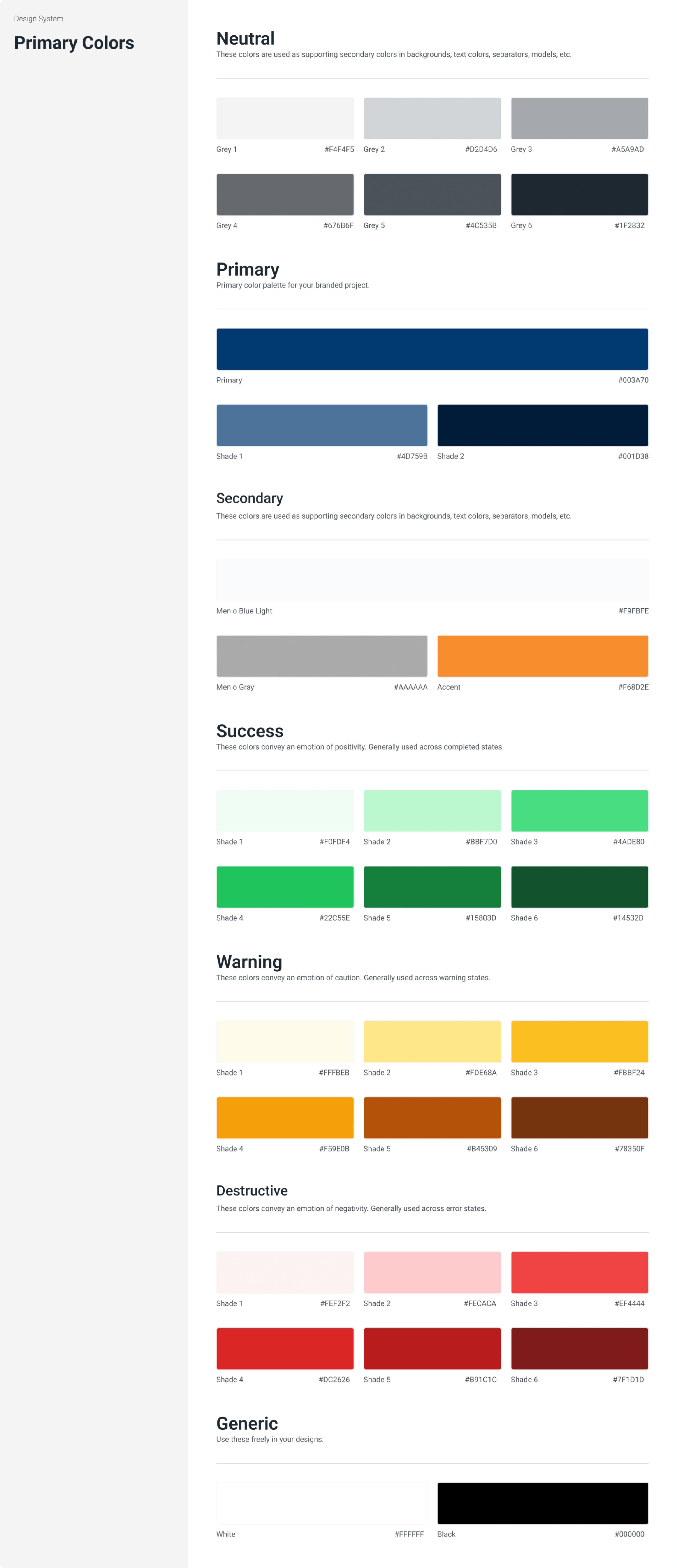
- No unified design system
- Key flows like Apply, Visit, and Give were buried
- Poor mobile performance + long load times
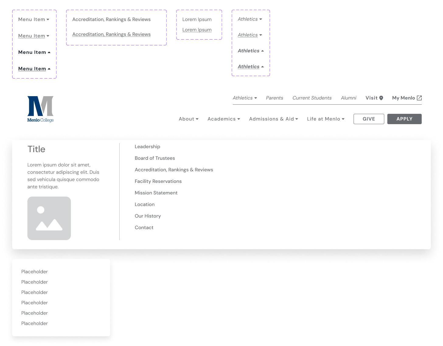
- Users got lost in menus with unclear hierarchy
- No SEO strategy
What I did
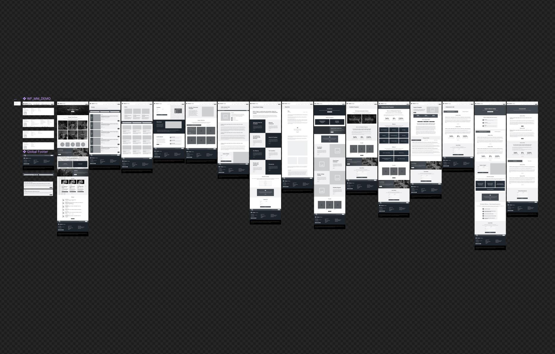
- Rebuilt content architecture and IA from scratch
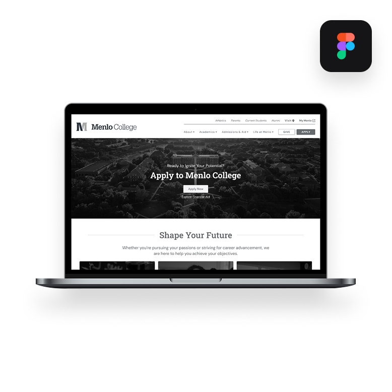
- Designed responsive UI system in Figma
- Created modular components for dev handoff
- Migrated backend to WordPress for speed + maintainability
- Embedded SEO into structure and markup
- Clarified nav with direct paths to enrollment actions
Results
- Bounce rate dropped 40%
- Enrollment inquiries up YoY
- Lighthouse scores >90 across all devices
- Admissions called UX a “major improvement”
What I owned
- Strategy
- UX flows
- UI system
- Client communication
- Dev handoff
Outcomes
- Better UX = more applications. Clean design delivered clarity that moved users.
Tools
Figma
Adobe CS
Basecamp
AI